Making glucose monitoring feel less like a burden
Overview
My client focused on creating solutions that simplify the lives of people living with diabetes, from monitors to effective blood glucose testing. They were looking for a mobile app solution that would pair & sync readings from patients bluetooth monitors. To help accomplish this initiative, my team and I focused on understanding diabetic patients journey with diabetes in order to design an app that they would actually use in conjunction with their monitor.
The Challenge
The main challenge would be balancing the clients feature requests within the amount of time and budget allotted for the products MVP release. Our greatest success would come directly from understanding our audience and merging requests from the client with customer expectations.
Process
Our team began with user interviews in order to understand what living with diabetes is like and how we could tailor our solution to not feel feel cumbersome or intrusive. The interviews would serve as our north start in order to design a solution that would meet the requests of our client while satisfying the needs from diabetic patients. From our first round of interviews we identified a couple of key insights that would inform our information architecture:
Patients seek to add context to their readings, so that when they reviewed their levels with their providers in person, they can point to specific reasons for a high or low reading.
Patients feel unnecessary stress when they have to add another process to their existing regimen, especially one that reminds them they have the disease.
In tandem with our information architecture taking form through wireframes, I started to conduct a brand audit to see what elements of the brand we could use to reinforce the features of the product. Since the client had not developed a mobile app before, they requested assistance to help create a new brand language beginning with this product. Through a competitive analysis and some quick discovery activities with the client, I curated two distinct visual directions in the form of Style Tiles. Given our timeline, we decided to test some of the conceptual UI from the style tiles in conjunction with our wireframes.


Based on learnings from testing, we solidified the I.A. and began to apply the visual direction to each feature of the app. We then tested a working iOS prototype with the patients. This round would help us validate both our visual design and feature set, while allowing us to remove unnecessary features that weren’t integral to the MVP.
Solution Highlights
1.) My Day (Dashboard)
As a user syncs or manually logs readings, they will see a summary of the completed information on this screen along with a progress bar that fills up depending on what they have recorded. In order to make it more accessible to log, users have various points of entry into the feature.
2.) Logging
Blood Sugar Readings
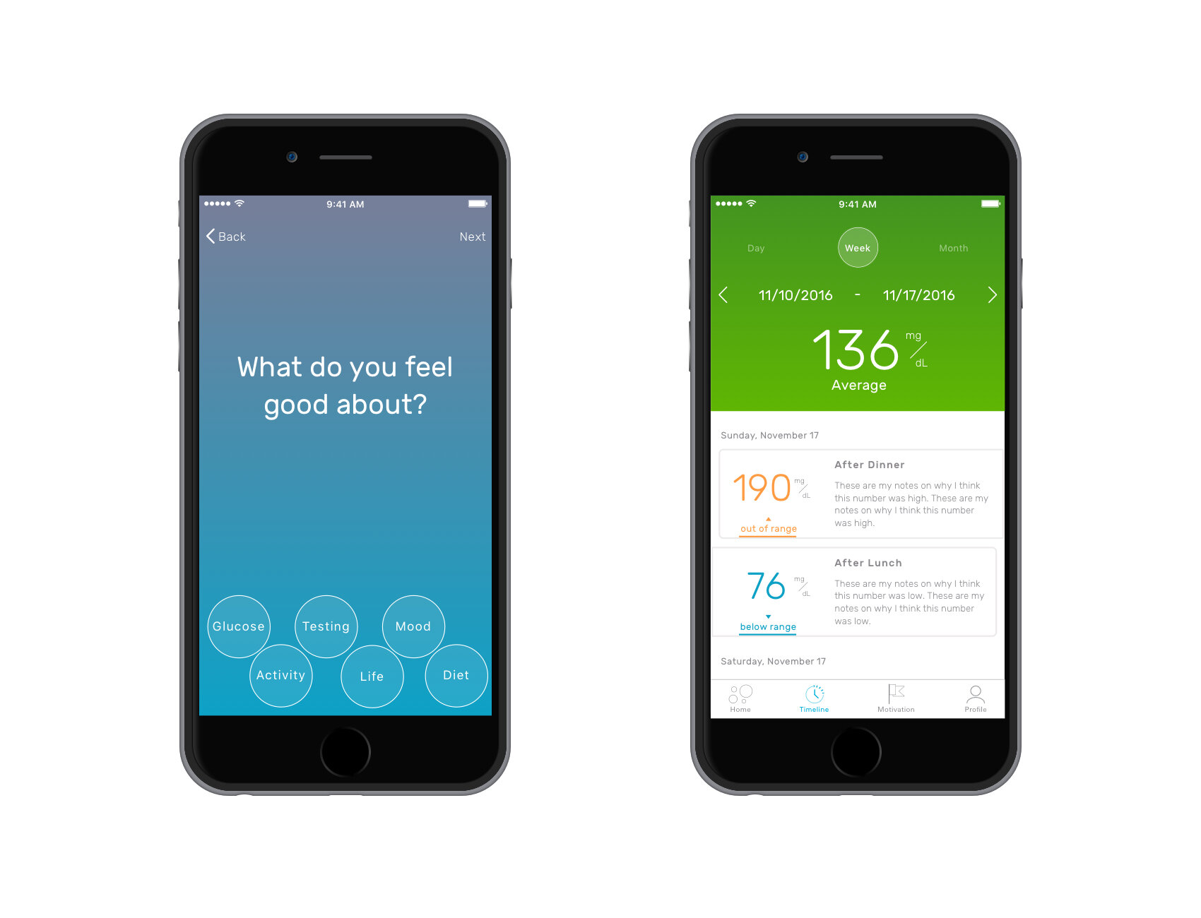
Users can sync their readings from their bluetooth monitor to their app or manually add their readings via the “Start My Log” button. The user will be guided through selecting the timing of the reading, the time of the reading, their blood sugar reading and any reason why they were in high or low.
Activity, Diet & Mood
Once a user logs their blood sugar they have the option to select the levels of each category that best matches their quality before taking the blood sugar reading. The details section on each page is completely optional.


3.) Motivators
A feature not required by the client but one resulting from testing. When asked about what motivated patients to log their readings, many participants indicated that their family & friends were their motivators. They made logging their main priority so that they could be healthy for them. Motivators allowed users to make the app feel more personal and tailored to them, which would help them to succeed in reaching their goals.
4.) History
History allows users to view all past blood sugar readings for each day in a calendar like view. It also allows them to add missing information or edit incorrect information that was entered on the day selected.
The Outcome
We successfully made an MVP launch for both iOS and Android versions. We were grateful that our client allowed us to steer the product in a direction that would suit their needs while also fulfilling the needs of their future customers. One of the most promising features that was slated for a future enhancement was the ability to tie into Fitbit and Apple Health in order to allow users more opportunities to connect with their readings.
Learnings
This project gave me a lot of perspective into the lives of those living and affected by diabetes. The success of this project goes hand in hand with the empathy my team and I gained through speaking with these patients. This was also my first project working so closely with iOS + Android developers which gave me a real appreciation for the native mobile practice and what it really takes to build an app from scratch.


